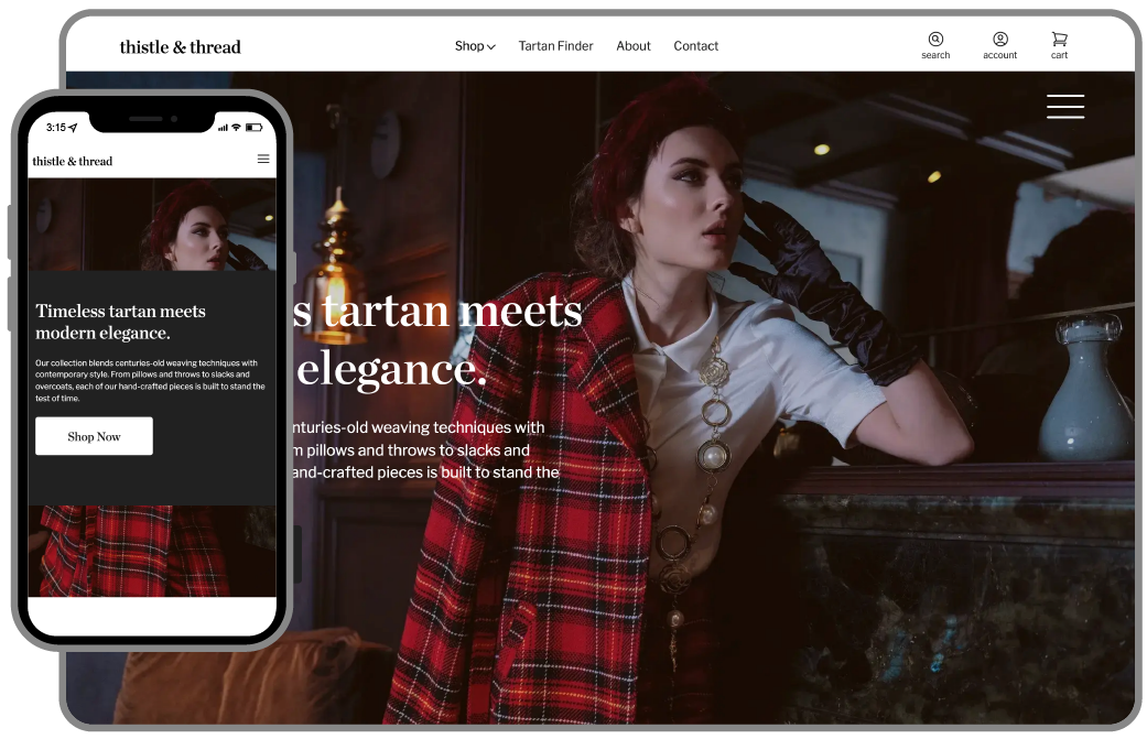
Advanced Responsive Web Layout with Interactive Features

Project Overview
As part of the Advanced Layout project, I worked on a responsive, multi-layered and complex web page which required interactivity. With the help of HTML and CSS, I added a modal window, a scrollable sticky navigation, horizontal opening sections, a paralaxing image in the background, and easy-to-find semantic form. Measurements, colors, and fonts from the Figma file were followed to ensure that the design intent was met. I employed a combination of elastic and rigid layout methods with properly defined media queries to ensure the site was viewable on all devices, right down to 320px. I ensured that the final build was able to work on Edge, Firefox, Chrome, and Safari browsers, and WebP images were properly expanded without changing the proportions. This project further developed my ability to create responsive layouts and more clearly showed how important semantic HTML is for writing accessible and fast code.
Key Features
- CSS Grid and Flexbox for responsive design
- JavaScript for interactive elements
- Design that adheres to accessibility guidelines
- Compatible across multiple browsers